
A successful marketer must be good at marketing, and at the same time good at selling. The selling can be achieved by communicating their message effectively. We have two stakeholders to sell, internal management, and external customers. With more and more data being available at our fingertips a marketer needs to be able to understand and effectively communicate the story behind those numbers. The data is only as good as your ability to understand and communicate it by visualizing it using the right graph or chart.
Translating those data into data-backed decisions and formulating strategies requires understanding patterns, correlations, and the ability to use the right visualization. All these can be achieved by using Microsoft Excel. You don’t need to use any other software or paid web services. In this article, we will talk about creating design compelling charts & graphs that are easy to understand by using Excel. You will also find the excel template for download at the bottom of this blog post.
Column Graph
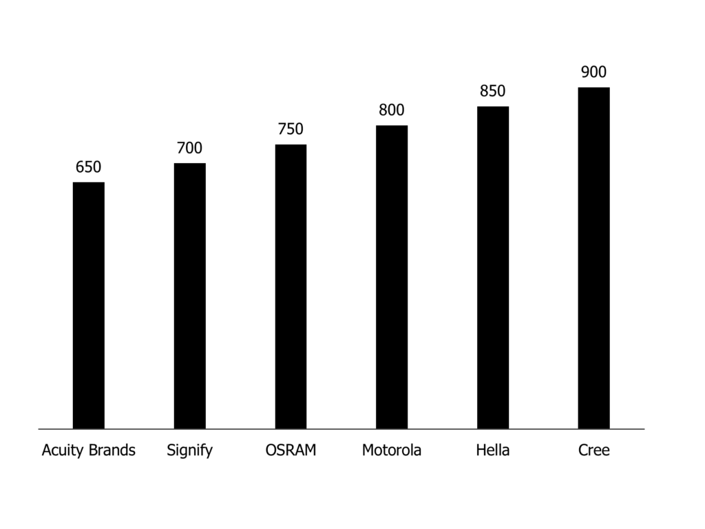
The column graphs can be used to compare values across different categories and also can be used to show change over a period of time. As a marketer if you want to show or compare your sales numbers or the number of followers, you can use this simple and easy under the column bar graph.
Bar Graph
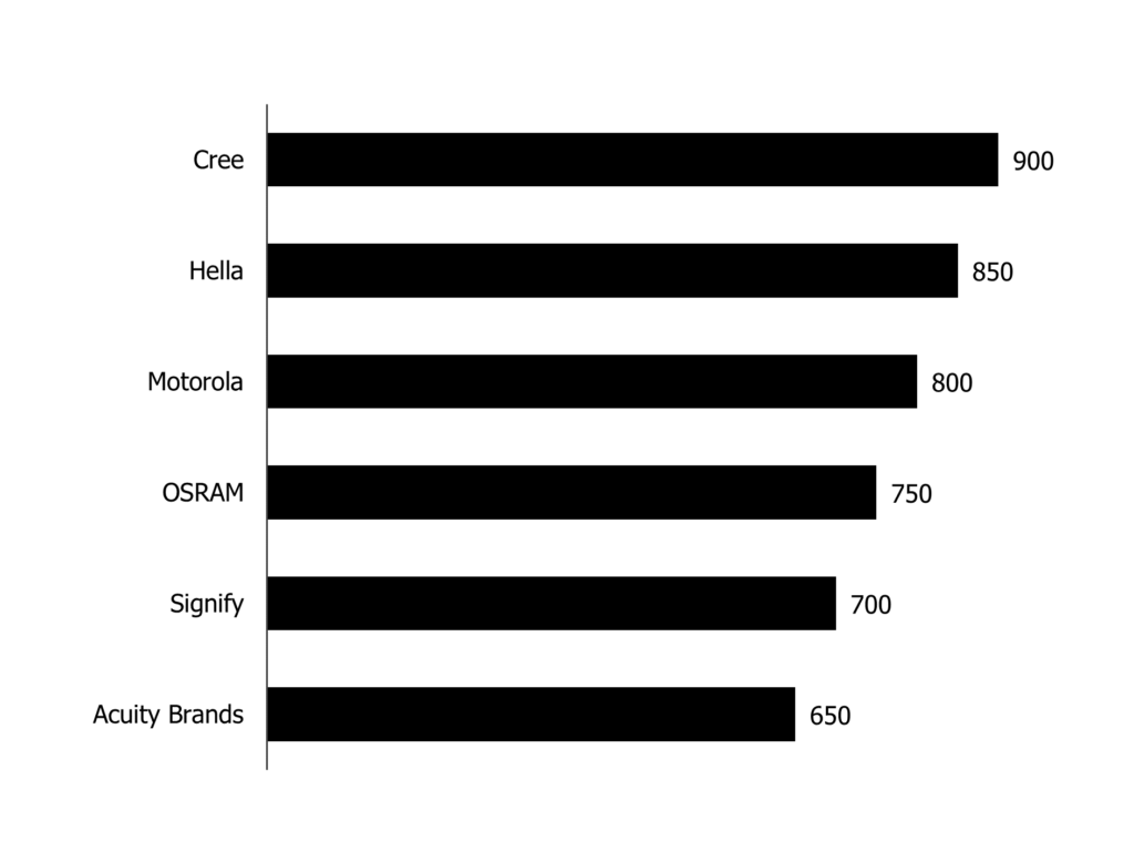
The Bar graphs are usually used to compare values across categories. Such graphs are great for comparing different values with our company to competitors. The lengths of the bars are proportional to the values.
Thermometer Graph
A thermometer graph is suitable for showcasing the progress of the task or the value in comparison to a predefined value. For example, if you want to show actual status compared to your target / KPI, then this is a graph to use. This graph is effective and easy to understand for the audience. Top-level management loves such graph to see the progress compared to the target.
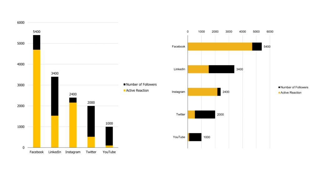
Comparative Column Graph
The comparative column graph can be used to compare values where you are showing results compared to a fixed value.
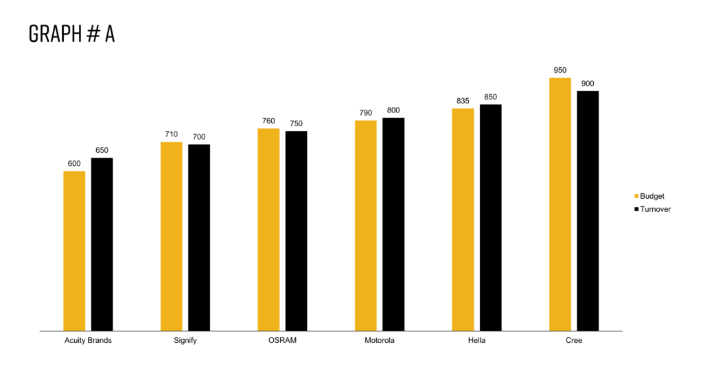
Graph # A is a rather simple and easy graph. The disadvantage of this graph is that it is visually appealing only when there are a few categories. If there are many categories, the values get cramped and become hard to read.
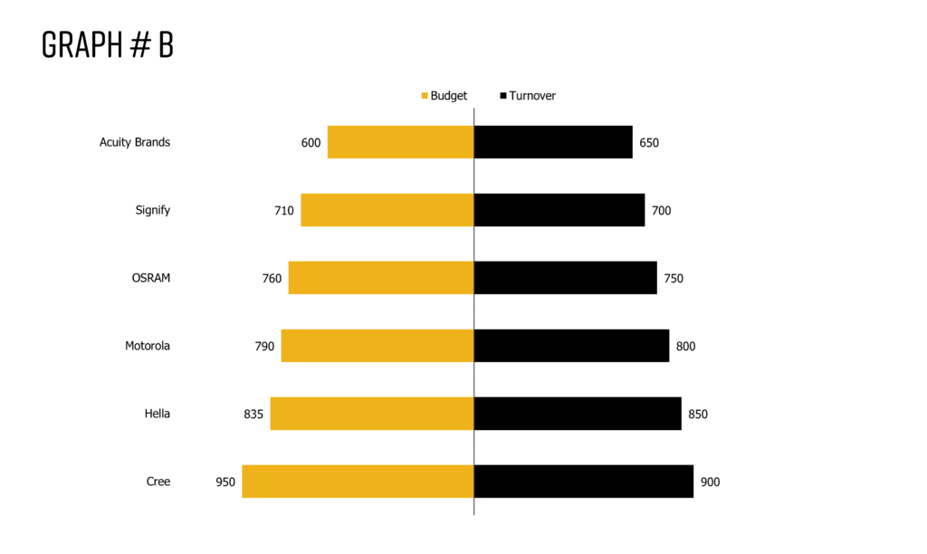
Hence, we recommend using Graph # B, because it is clear and there’s more freedom of showing more categories. For example, Budget vs Actual data can be shown perfectly using this graph. On the left side, the bars show the budget value in one colour that compares the actual value on the right side in a contrasting colour.
Line Graphs
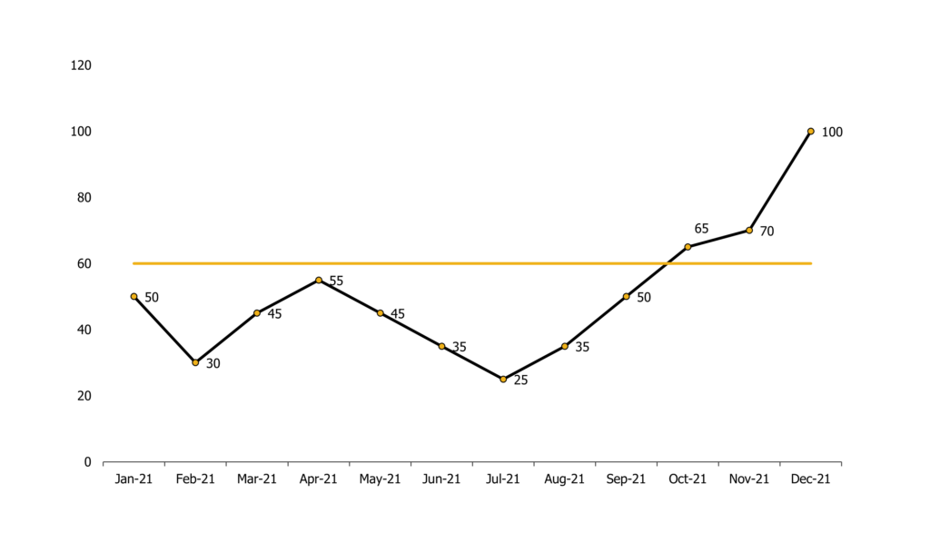
The line graph is best for displaying trends or progress over time. If you are showcasing monthly/yearly trends over a continuous period. My advice to you is that when you use a line graph always set up a frame of reference for the audience. For example, when comparing the usual monthly average to the actual monthly trend, the line graph can be used to capture your audience’s attention.
Pie Chart
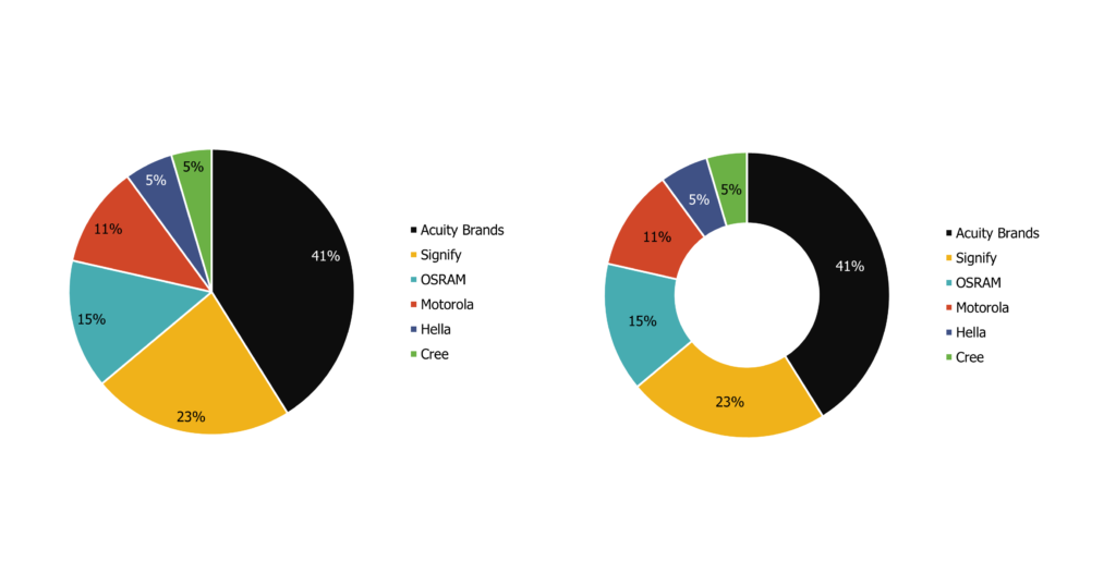
A pie chart can be used effectively to represent different categories that belong to a whole. The pie chart represents numbers in percentages, and the total sum of all segments always needs to equal 100%. If you have more than 5/6 categories it’s better not to use this chart because the graphs get overcrowded and the audience is unable to read. Always make sure that all the slices values add up to 100%.
Waterfall Graph
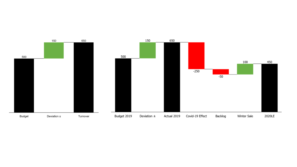
The waterfall graph is best used to show how an initial value is affected by intermediate values. The intermediate values can be positive or negative that influences the result in a final value. For example, showcasing overall company revenue is influenced by different factors and leads to a specific outcome.
Bubble Graph / BCG Matrix
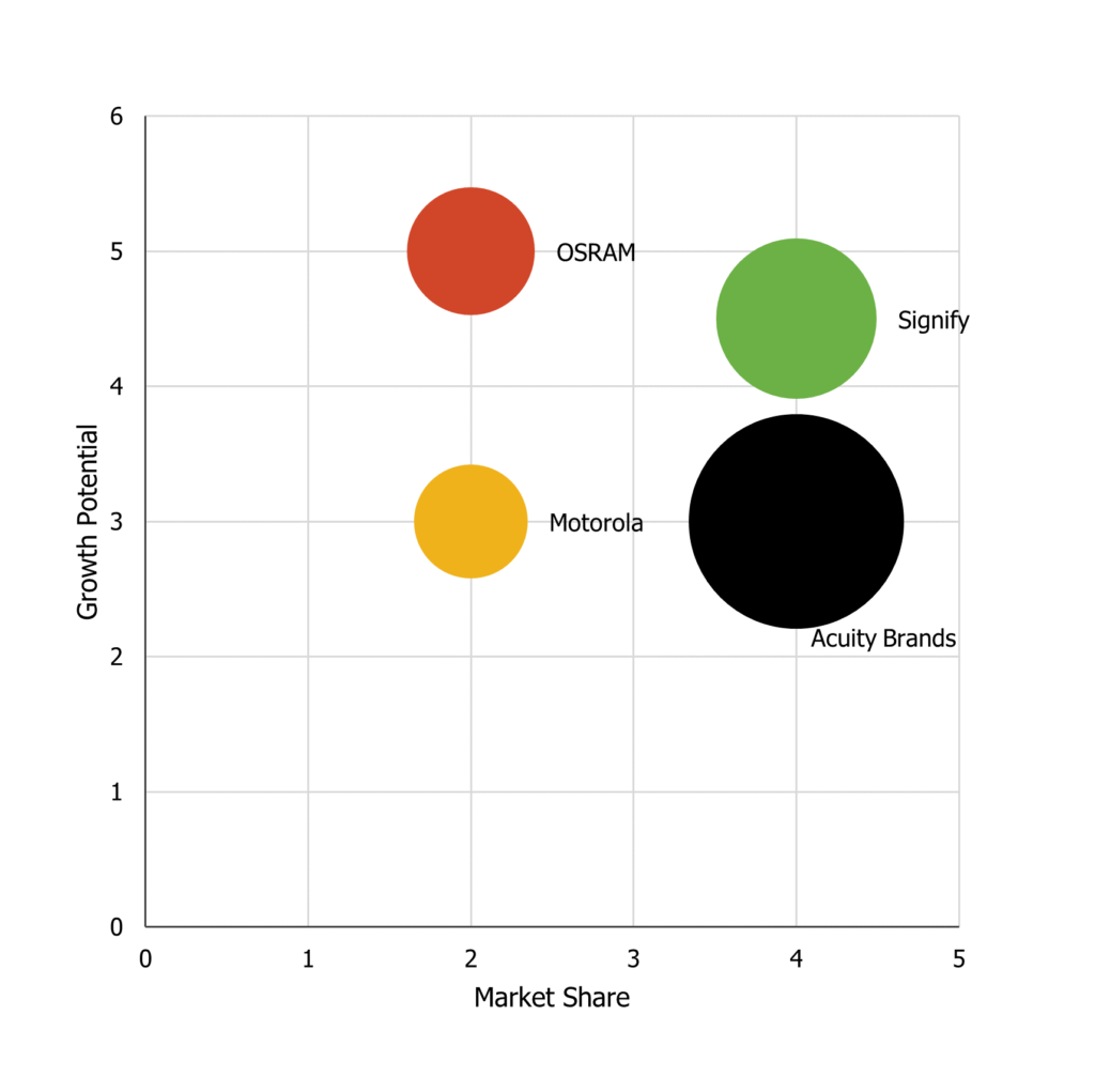
The bubble chart is designed to visually convey three or four dimensions of data. A typical example of using this type of graph would be the BCG matrix. The bubble graph is perfect for data-driven long-term planning. Identification of growth opportunities by reviewing customers or products, decisions on whether to invest or discontinue or develop a product can be made easily by viewing this graph.
You need to make sure that you have three types of data. For example, relative market share on the X-axis, growth potential on the Y-axis, and the size of the bubble is based on weighted average turnover. Make sure labels are clear and visible. It is better to use a maximum of 10 bubbles not more.
Colours
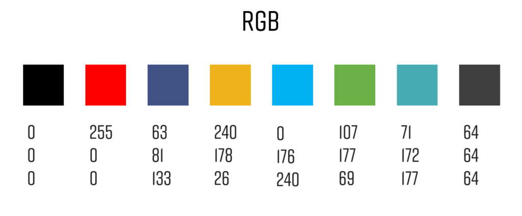
Just because there are millions of colours available, doesn’t mean we have to use them. Your goal is to convey the message, therefore try to avoid different colours because a lot of hues confuse the eye, so readers don’t know where to start first. Less is always more. Colour is a tool, but it should never be the starting point. Within one graph, try not to use more than three different colours. Use different colours only when you are comparing different categories. If you use the right graph for the right data, one colour is just enough. Within a presentation try to be consistent with using the same colour. This will make your presentation powerful and appealing. Last but not least, follow the corporate guideline of your company. Get in touch with your marketing and branding colleagues if you need help. For this blog post, we have used the following colours.
Fonts
All the charts are made using Tahoma Font, which is a pre-installed font from Windows. We recommend the following five fonts for visualizing your data and ensuring readability.
- Segoe
- Candara
- Tahoma
- Corbel
- Franklin Gothic
I would love to receive inspiring updates from team Oridoc.


0 Comments